In the previous post, we learned how colors affect us and how to use a color wheel to find interesting color combinations.
In this tutorial, I’ll show you how to color grade your photos in Lightroom.
What is color grading?
Color grading involves enhancing a photo’s visual impact and depicting a particular mood.
In Lightroom, you can achieve the desired colors with various tools, such as white balance, saturation, HSL sliders, and the color grading panel.
Before getting into the practical steps of color grading, it’s important to understand the basics of color theory. You can refer to this article to learn the basic concepts of color theory that you must know as a photographer to enhance your photo’s visual appeal. Please do not skip it, as these principles are followed throughout this tutorial.
Overview of the color tools in Lightroom
Lightroom has two main features to help you achieve your desired colors: the Color Grading panel and the HSL sliders.
Let’s take a quick look at the color controls available in Lightroom.
HSL Sliders
HSL is an abbreviation for Hue, Saturation, and Luminance. To put it simply, Hue means, “What color?”, Saturation denotes “How much color?”, and Luminance deals with “How bright or dark is the color?“.

In this panel, you can adjust hue, saturation, and luminance sliders for various colors: Red, Orange, Yellow, Green, Aqua, Blue, Purple, and Magenta. The combination of these sliders gives you precise control over the existing colors in your photo.
With HSL sliders, you can’t change or add colors that aren’t present in the photos. That means you can’t tweak the reds if there are no reds in your image, and you can’t add reds.
There are four tabs on the HSL panel: Hue, Saturation, Luminance, and All.
The Hue tab handles the base color. Each hue slider has two colors on each end. When you move the slider in either direction, the selected hue changes to the color on the end you’re moving towards.
For example, if you want Reds to become Orange, move the Red hue slider to +100. On the other hand, if you wish to turn Greens into Yellow, you set the Green hue slider to -100.
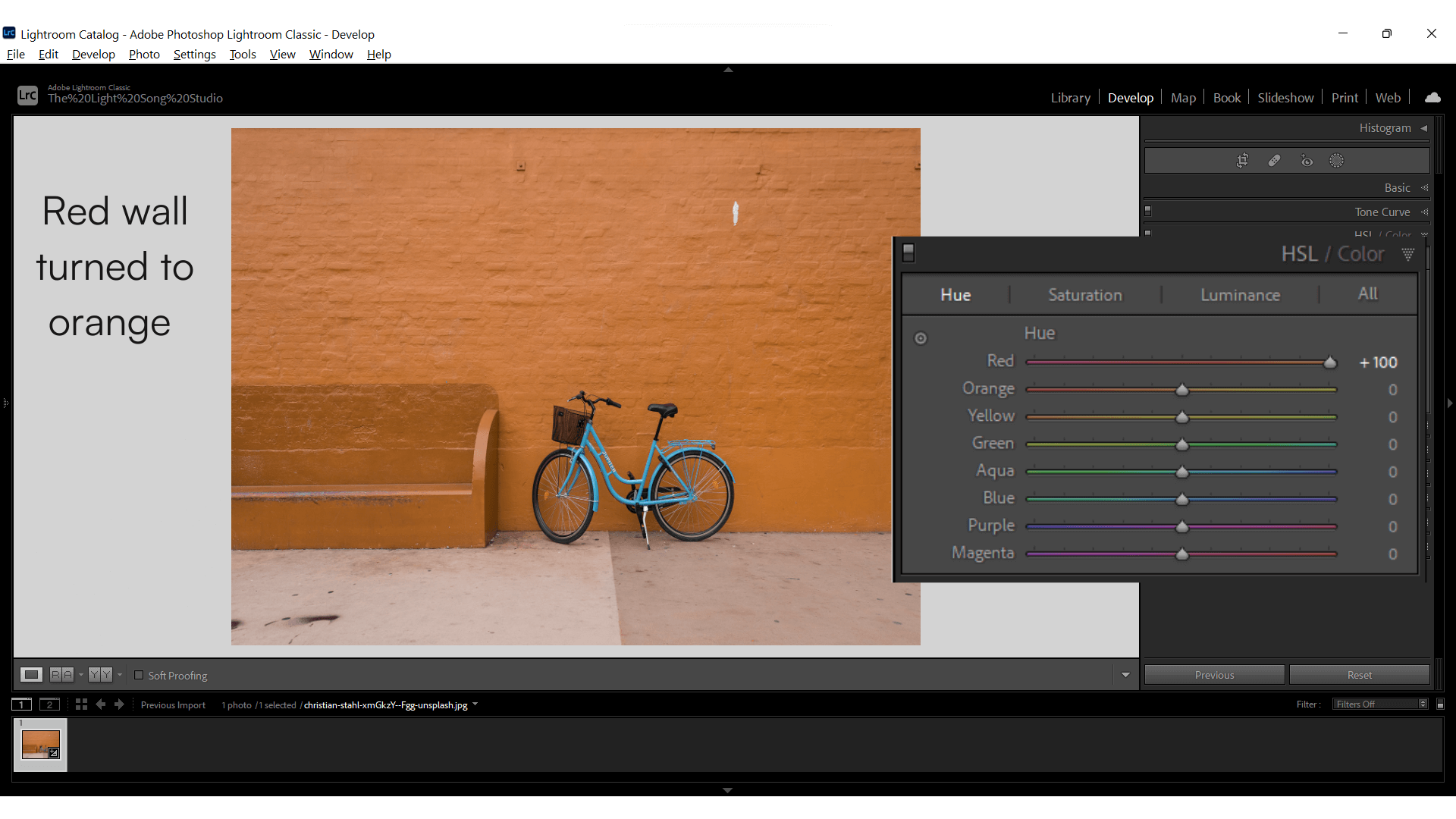
However, if you want to turn Reds into Yellows, you first make Reds orange by moving the Red hue slider to +100, then turn Oranges yellow by moving the Orange slider to +100.
The saturation sliders offer intensity control for each color. A -100 value on the Saturation slider will desaturate the selected color from your photo and turn it into
grayscale. Inversely, a +100 value will make the selected color look punchier and louder in your photo.

Luminance adjustment makes your selected color brighter or darker. It is very close to making tints (adding white) and shades (adding black) of a color.
Color Grading Panel
Color Grading is a recent addition to Lightroom. It replaced Split Toning–a feature limited to colorizing only highlights and shadows. However, don’t confuse “Color Grading,” a Lightroom feature, with “color grading” the process.
The color grading panel has four orbs, each representing a color wheel for shadows, highlights, mid-tones, and global color. An accurate color wheel lets you visually map and adjust the colors according to your chosen harmony.


When you click on a wheel, two circles appear. The outer circle lets you choose the hue, and the inner circle controls the saturation. You can stop these circles from moving arbitrarily by holding down the ‘Command’ or ‘Ctrl’ key for Hues and the ‘Shift’ key for intensity.
The slider under each color wheel controls the luminance of the color in the selected tonal range. Sliding it right will make the hue more prominent, and sliding it to the left will reduce the effect.
You can control how much the highlights, mid-tones, and shadows overlap with the blending slider. A higher value makes the transition smoother, while a lower value does the opposite.
You can choose which way the color effect is skewed with the balance slider. On the left, the color set with the shadows wheel will take over, and on the right, the highlight colors will.
Difference between HSL and Color Grading Panel
Even though both are valuable tools for color enhancement in Lightroom, their functionality is fundamentally different.
HSL targets the colors and their properties–hue, saturation, and luminance–while the Color Grading panel allows you to target luminance values, shadows, mid-tones, and highlights in the photo.
For example, you can make red look orangish with HSL, but you can’t turn the brightest areas in the photo (the highlights) into a sunset orange glow. For that, you need to play with the highlights circle in the Color Grading panel.
Let’s color grade some photos in Lightroom
Working with Lightroom’s color tools can be a bit tricky for beginners. But when done correctly, even minor color tweaks can make your photos outstanding and more expressive. In the examples below, I’ll walk you through every step in the process so you can replicate them in your photos.
You can also download these photos and follow along to understand better.
Color Grade Tutorial 1 – Outdoor Portrait
In this example, I’ll color grade an outdoor portrait photo with a detailed background and sky. You can download the image here.
In this case, I’m going towards a complementary color scheme.
Please note that you should always keep color grading as the last step in your photo editing workflow.
Step 1: Take a look at the existing colors in the photo
Before making any changes, let’s look at the current colors in the picture. The goal is to find interesting parts, make them stand out, find weak spots and make them less noticeable.
We want to draw the viewer’s attention to the area of interest in the picture and make the whole thing pleasing.

This photo contains primarily reds and greens and some purple in the flowers. I love the model’s dress and hair in this photo, so I want to highlight these parts.
The purple of the flowers in a primarily dark photo stands out. However, I want to bring viewers’ attention to the model.
I’ll use the complementary harmony between red and green in this photo.
Let’s first add some punch to our colors.
Step 2: Adjust individual colors with HSL
To make our model the primary attention holder, I’ll do the following with the HSL sliders:
- Tone down saturation of purple flowers (Purple and Blue Saturation)
- Accentuate the glow in the model’s hair (Red and Orange Luminance)
- Make the dress a brighter red (Red Luminance)
- Move green hue to a subtle aqua green (Green Hue)
- Slightly darken the green background (Green Saturation)

Please note colors present in the photo aren’t the purest hue and are mostly a mixture of two or more colors. The best way to target colors in a specific area in an image is to use the pointer tool on the HSL panel.
Here’s what the photo looks like after the adjustments.

Hue | Saturation | Luminance |
|---|---|---|
Red: -25 | Red: +20 | Red: +55 |
Orange: -5 | Orange: +1 | Orange: +20 |
Yellow: -30 | Green: -20 | Yellow: +2 |
Green: +45 | Blue: -15 | Green: -15 |
Aqua: +5 | Purple: -20 | Aqua: -25 |
Blue: -15 | ||
Purple: +5 |
Step 3: Colorize Highlights, Shadows, and Midtones with the Color Grading Panel
With HSL, I tweaked color properties. Such adjustments are not possible with the color grading panel. In this next step, we’ll add colors to the luminosity of the photo, meaning we’ll colorize the shadows, highlights, and mid-tones.
The shadows in this photo are mainly the green background. I want to go for a cool tone in that part. For that, I dialed in these values on the shadows wheel.

To complement the cool blues, I chose yellow-orange, the opposite color on the color wheel. The model’s skin, dress, and flowers are highlights in this photo. We chose a warm tone as it’ll make our subject stand out.

I chose light blue for the mid-tones as I wanted all the colors to blend well. However, the saturation is kept to a minimum here.

I wanted an overall warm look, so I moved the Balance slider slightly toward the plus side. Also, I added a hint of warmth to the global color circle.

“Less is more” is a good rule for color grading, just as it is for any other type of post-processing. Therefore, ensure you don’t go overboard with editing adjustments, as it can lead to unnatural effects and make your photo useless. Another idea is to make edits, leave it for a few hours, and give your eyes rest. It allows you to return with a fresh perspective and fine-tune it before saving the final copy.
Here’s Before and After


Color Grading Tutorial 2- Sunset Landscape
Every photo is different and needs its own color treatment. Let’s look at this beautiful photo of Mount Fuji at sunset. You can download this photo here and follow along with the tutorial.
Step 1: Analyze the colors in the photo
The first thing I notice in this photo is the lack of a golden glow from the sunset. Highlights are washed out, and overall, the image looks dull.
Below is a palette of the dominant colors in the photo.

As you can see, most of the colors in the picture are neutral. I want to give the highlights an orange glow and make the water a little bluer for this image. I’ll choose orange and blue here because they complement each other.
Step 2: Correct color with HSL Sliders
I’ve made the following adjustments in the HSL to prepare the photo for color grading.
- Accentuated blues in water and sky
- Turned sunset glow from yellow to a yellow-orange
- Lowered luminance value of orange and yellow to make the glow look deeper
- Reduced luminance values of blues
This is how the photo looks after the tweaks with HSL.

Hue | Saturation | Luminance |
|---|---|---|
Orange: -33 | Blue: +40 | Orange: -26 |
Yellow: -14 | Purple: +3 | Yellow: -8 |
Blue: +9 | Blue: -8 |
Step 3: Colorize the Luminosity with the Color Grading Panel
I was looking for a blue and orange combination in this picture. I added blues to the shadow, i.e., the darker parts of the water and the sky, and made the bright sun on the left side of the mountain orange by adding it to the highlights.
I also made the mid-tones orange, which makes a smoother transition from blue shadows to bright highlights.
Below are the values I’ve put in the color grading panel.

Here’s how the photo looks after the complete process.


Conclusion
The color of your photos can make or break them. Choosing the right colors is an essential part of good photography. But make sure you base your color grading on the timeless principles of color theory and make good use of color tools in Lightroom.
Keep shooting.