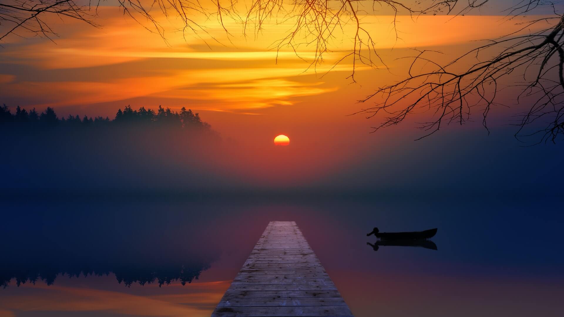
Color is the most powerful and indispensable tool for photographers, whether you’re into shooting landscapes, portraits, or any other photography genre. For centuries, color has been used in art to elicit specific emotions, depict a particular mood, and portray things in realistic detail. Even though light is the most talked about aspect of photography, our emotional response to a photograph is strongly influenced by its predominant colors.
How do colors affect us?
Every color evokes a different emotional response in humans, and as a photographer, you must be adept with colors’ influence. Red, for example, symbolizes strong feelings like passion, power, lust, and danger. Yellow offers warmth, joy, energy, and enthusiasm. The color green implies envy, greed as well as the natural world. Whereas Purple is the color of royalty, creativity, mystery, romance, and sadness, blue signifies calm, serenity, and trustworthiness.
You may be surprised at how many apps on your phone have the blue-colored logo. Now, you can guess why there are so many of them. We interact with colors every day without knowing it. Whether scrolling through an Instagram page full of dreamy, pastel bright photos or walking down a busy street packed with large and small adverts, we’re being influenced by colors.
Advertising uses various color combinations to sway the emotions and perceptions of potential customers. From airports and hotels to bookshops and hospitals, there’s a purposeful use of color everywhere to induce a specific psychological effect in people. You might wonder how to use this information in your photography. This article guides you step by step on how you can effectively use colors to make your photos more expressive and pleasing.
Let’s dive in!
Color Theory Essentials for Photographers
Color theory is the art of creating pleasing combinations of colors known as color harmonies that evoke the desired mood or accurately express what you want to say with your art. Visual artists take the help of a color wheel to choose the right colors for their artwork.
The Color Wheel
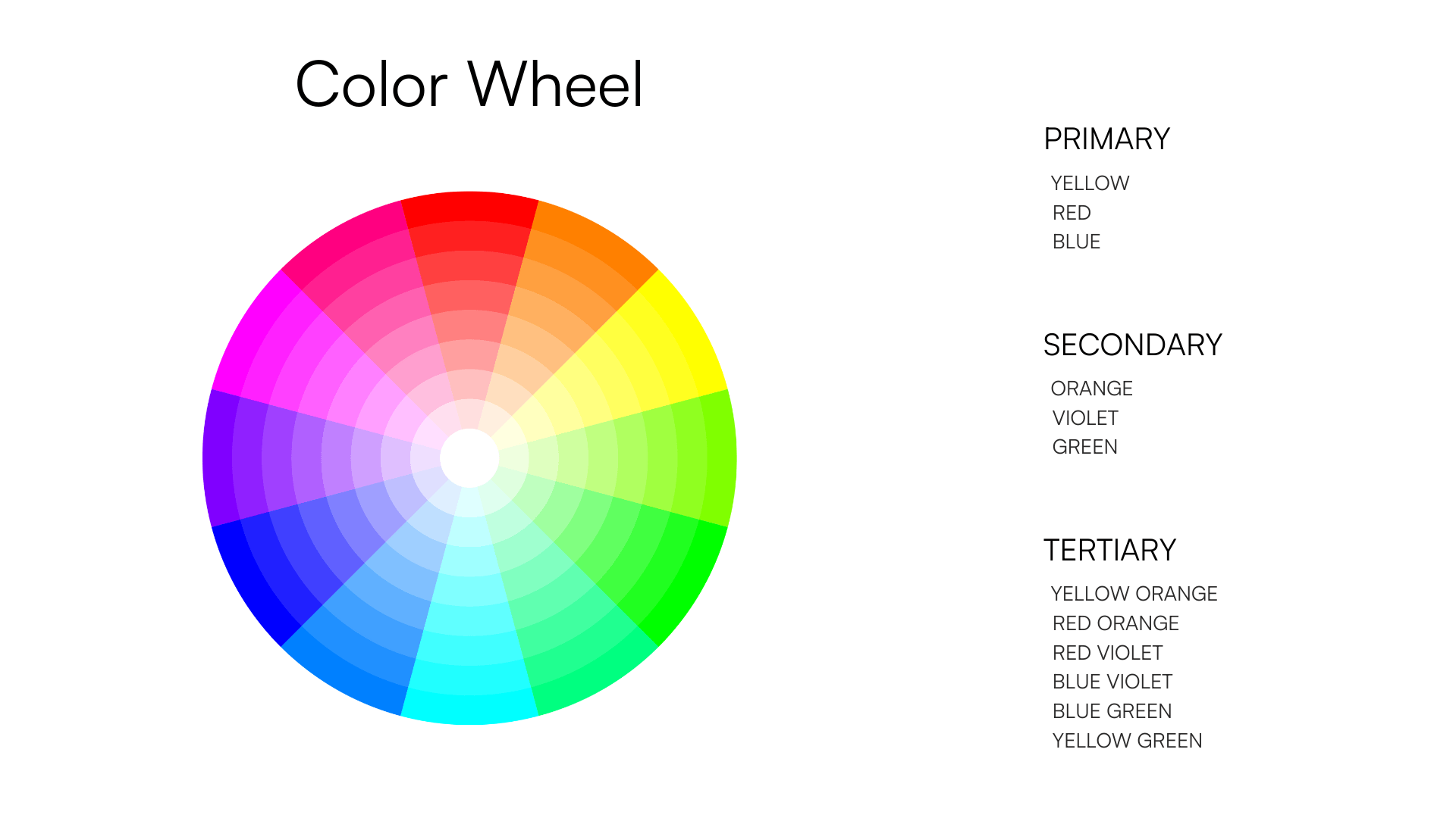
A color wheel is a tool that helps you see which colors go well together. It’s laid up to make it easy to identify exciting color combinations quickly.
The colors are divided into primary (Yellow, Red, Blue), secondary (Orange, Green, and Violet), and tertiary colors (Red-Orange, Yellow-Orange, Yellow-Green, Blue-Green, Blue-Violet, Red-Violet). They are arranged in a circle according to the harmonic relationship between them. The primary colors are all spaced out proportionally. The secondary and tertiary colors are placed in between the three primary colors.
Hues
Hues are the three primaries (red, blue, and yellow) and the three secondary colors (orange, violet, and green) found on the color wheel. In other words, the visible spectrum (of the primary & secondary colors) that is most prominent in a color is referred to as its hue.
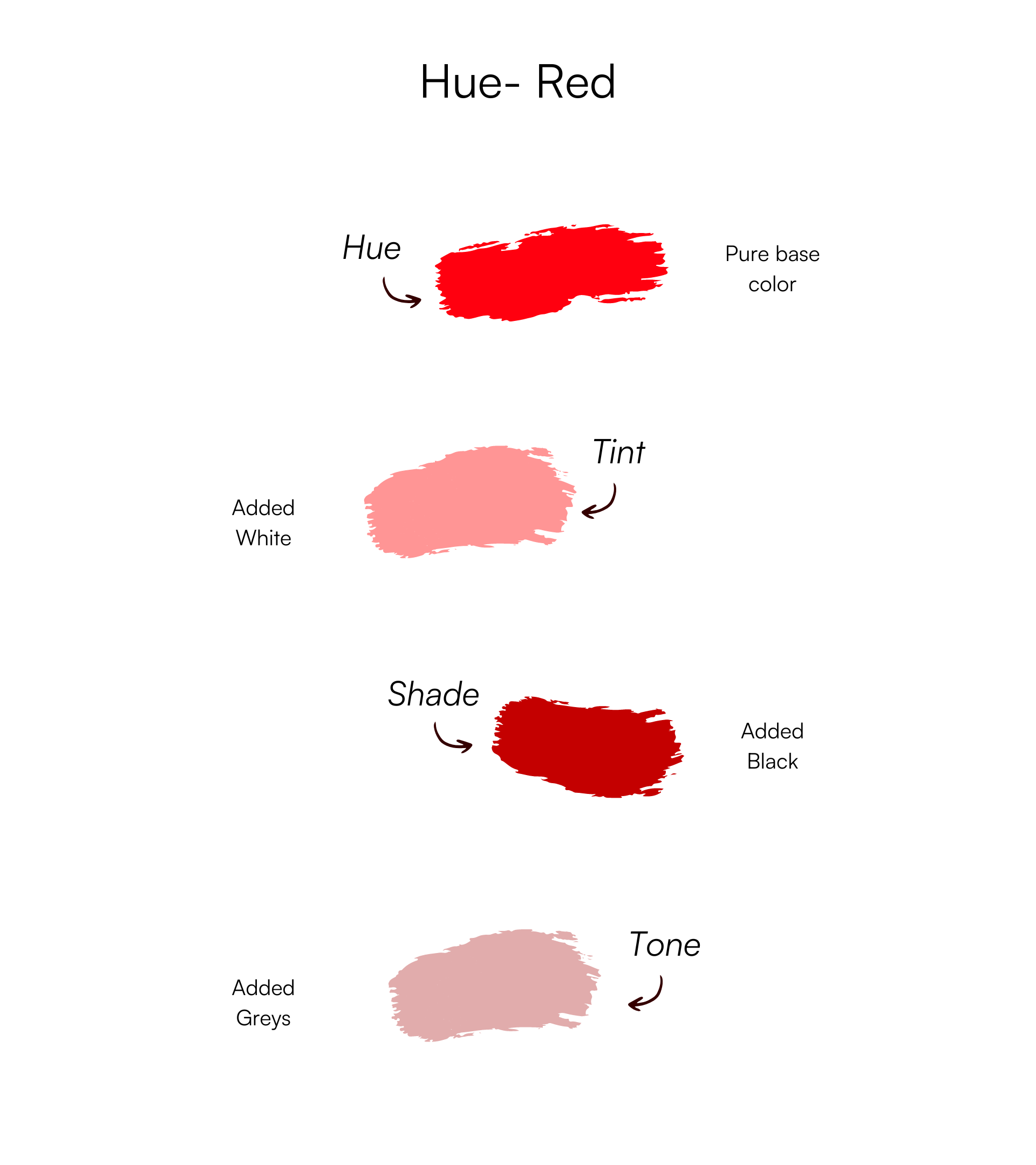
People frequently use the terms “hue” and “color” interchangeably. However, the meanings of each are different. The definition of the word “color” is rather broad. A color can be any tint, shade, or tone; for example, it could be pink, magenta, peach, or sky blue. But their dominant hues are red, violet, orange, and blue, respectively. Hues are the base of any color mixed with other colors, including white, black and gray.
Tints
Adding white to any hue on the color wheel makes a tint. Tints have a lower saturation level and a lighter appearance. You can also create a tint by mixing two or more hues and adding white to the blend. When adding white to pure hues, the resulting tint may appear brighter; however, it’s just a paler version of that hue. Tints are sometimes referred to as pastel colors as well.
Tones
Tones are achieved by mixing gray (a blend of black and white) with hues. Depending on the amount of gray added, a tone may be brighter or darker than the original hue. The only colors in gray are black and white, which is why it is considered neutral. Tones are pleasing to the human eye. Maybe that’s why most of the colors we see daily are toned to certain degrees.
Shades
You can make a shade by adding black to a hue. A shade makes a color darker as no white or gray is added. The hue remains the same when making a shade but gets darker. The range of darkness of a shade can vary from a little dark to almost deep black with just a hint of the hue in it.
Color Harmonies
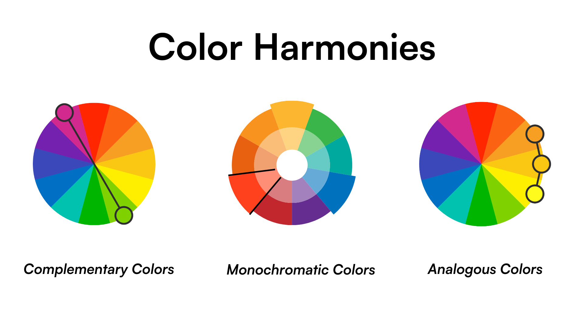
Color harmony combines colors that work well together based on the color wheel. It’s the key to producing visually appealing photos. These tried-and-true combinations are chosen based on their relative positions on the color wheel.
Let’s discuss the three most popular color harmonies you can use to enhance your photos.
Analogous
Analogous colors sit next to each another on the color wheel. These are the colors that have some similarities between them yet are different. An analogous color scheme brings a flow and balance to your photos. Primarily, there are three colors in an analogous harmony, though you can have a minimum of two and up to five colors.
A few examples of the analogous scheme are [yellow-green, green, yellow-orange], [blue, blue-green, green], [red-orange, red, red-violet], and [blue, blue-violet, violet].
Complementary
The colors that are opposite each other on the wheel are complementary colors. Some examples of complementary harmonies are red and green, yellow and purple, and orange and blue.
Complementary colors are challenging to use effectively, especially if you’re new to photo editing, because these combinations have very high contrast. You can use this harmony to pinpoint the viewer’s attention to your subject. However, be mindful of overusing it as these colors can appear too loud in photos.
Monochromatic
Monochromatic colors are a single hue’s various tints, shades, and tones. Depending on the intensity of the neutral colors (black, white, and gray) you add to a base hue, you can generate a wide variety of tints, shades, and tones. These create a monochromatic harmony.
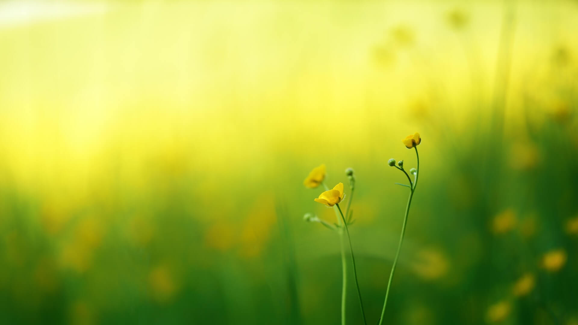
Here is an example of monochromatic color harmony:
A monochromatic color scheme creates a sense of oneness in photos and makes them easy on the eyes of the viewer.
Understanding the color theory has helped my photography at both stages–taking pictures and processing them. I hope it’ll make a difference to your photography as well.
Now that you know how colors work, you’ll be more aware of the color harmonies occurring naturally in your shooting environment. Even though you can choose how you compose your shots based on color theory, you still have limited control over external factors.
Stay tuned for a tutorial on color grading your images in Lightroom.
