Overview
Once you’ve mastered the settings of your camera, the next step is to understand the fundamental techniques of composition. Composition is how you choose to arrange the various visual elements within your photograph. You need a strong composition in order to make a visual story, but it’s not something you can calculate like you can with your settings. Composition is much more subjective, and as such is much more about your creative vision. Read on to dive into the 10 fundamental composition techniques you can implement to instantly elevate your photography.
1. Leading Lines
Leading lines give structure to your composition and draw the viewer to the key elements within your photograph. You can use leading lines to guide the viewer’s eyes through the image on a predetermined path. In this image here, the railing of the boardwalk directs your gaze across the photo until you land on the jogger on the other side. Leading lines are most powerful when they come in from the edge of the frame. They can be as subtle or as obvious as you wish to make them, and if you look closely enough, you can find them everywhere from road lines to a string of lights or even a tree branch.
2. Orientation
The orientation of your photograph refers to whether you shoot it in landscape or portrait format. A horizontal image, or landscape format, draws the eye from side to side; whereas a vertical image, or portrait format, draws the eye up and down. The format you choose to shoot in does not need to be dictated by your subject, meaning you don’t need to shoot exclusively horizontal images when photographing landscapes, nor do you need to shoot exclusively vertical when photographing portraits. The orientation of your photo should match the natural flow of your subject to guide the eye in one clear direction. If you’re photographing a scene of people that flows from side to side, shooting in landscape format will be more effective. If you’re photographing a towering rock formation, shooting in portrait will capture its immensity.
3. Framing Within the Composition
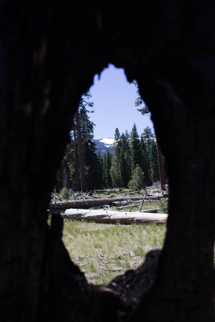
Particularly in busy scenes, framing allows you to draw the viewer’s attention to a particular portion of your composition. By framing your subject within an opening, such as a window or a doorway, you bring the focus onto your subject by creating a sort of photo within a photo.
In the image to right, looking through a hole in charred tree bark, you’re forced to hone in on a small portion of a busy landscape scene.
4. Foreground Interest
When it comes to landscapes especially, it can be easy to get lost in the big, beautiful vistas. But these images can sometimes become flat and overwhelming if there’s too much to look at without a clear visual path for the viewer. This is why creating depth is so important. When you separate the viewer from the middle ground and the background with foreground interest, you create a sense of depth in the scene and give the viewer a stepping stone into the image.
In this photo, the tree-lined mountain in front separates you from the iconic rock formations in the distance. The different layers invite you to hop across the image as you make your way to El Capitan and Half Dome in the far back.
5. Getting Close
By getting in close and filling the frame with your subject, you’re able to draw the viewer’s attention to the small details that would be lost in a wider composition.
On the left, a twisted log becomes an abstracted pattern of intricate lines. On the right, the proximity to the subject adds a sense of intimacy while also drawing attention to her freckles and the flowers in her hair.
There may be subtle details that caught your interest and your desire to capture an image in the first place. Getting in close to the subject allows you to convey this detail to the viewer.
6. Symmetry
Symmetry presents a sense of harmony and balance. We often find symmetry to be calming and appealing as it satisfies our primal need for order. You can achieve symmetry in your photos by mimicking shapes and placements from one side of the frame to the other. The towering cluster of trees below looks almost like a Rorschach inkblot test, perfectly matched from one side to the next.
Be careful not to cross the line from balanced to boring, though. A symmetrical image doesn’t always need to be perfectly mirrored. The slight variation in the size and orientation of the pumpkins on the left add a more human element to the composition without upsetting the overall balance.
7. The Rule of Thirds
The Rule of Thirds is one of the most commonly spouted composition techniques. Placing your subject in the center of the frame can sometimes feel stale. If you imagine your frame split into thirds, either horizontally or vertically, positioning your subject on one of these lines can give your photo a nice balance when you don’t want to center your subject. You can also place your subject in one of the four points where the horizontal and vertical lines of the imaginary grid intersect. This technique doesn’t have to be perfectly calculated for execution but rather used as a rough guideline. Just make sure to not place your subject only slightly off-center or too close to the edge of the frame, as this can often look a bit amateur.
8. Working the Frame
Minor adjustments can mean the difference between a busy image of happenstance and a carefully orchestrated photo where each element within the frame has its place and works together with the rest of the image. Everything that makes an appearance in your image should be there for a reason. Even the smallest of details should serve the photograph as a greater whole. If there is something that doesn’t contribute to the whole, then it doesn’t belong in your photo. Avoid these passive areas when composing your image.
This photo takes the a busy street of New York City and makes it more digestible, focusing your attention on the couple walking across the center of the frame and the man reaching into his bag as he approaches you from the left.
9. Visual Weight
Don’t be afraid of negative space within your photographs. When used correctly, it can add balance to your images. It’s all about the relationship between the different elements and their position within the frame. Determining the visual weight of your scene can seem complicated, but it’s something our eyes are already familiar with. You measure visual weight in your everyday life in situations such as finding the best place to hang a piece of art on a wall. It’s all a matter of applying this same skill to composing a photograph.
In this image, an old lady sits alone in a patch of sunlight watching a waterfall while everything behind her falls away into the shadow of the trees. She is content in her solitude, peacefully enjoying the scenery, completely unconcerned with the rest of the world.
10. Breaking the Rules
While all of these compositional techniques are great–even essential–building blocks for the foundations of photography, there comes a time, once you’ve learned the rules, to learn how to break them. Henry Carroll once said, “Good photographs conform to the rules. Really great photographs often break them.”
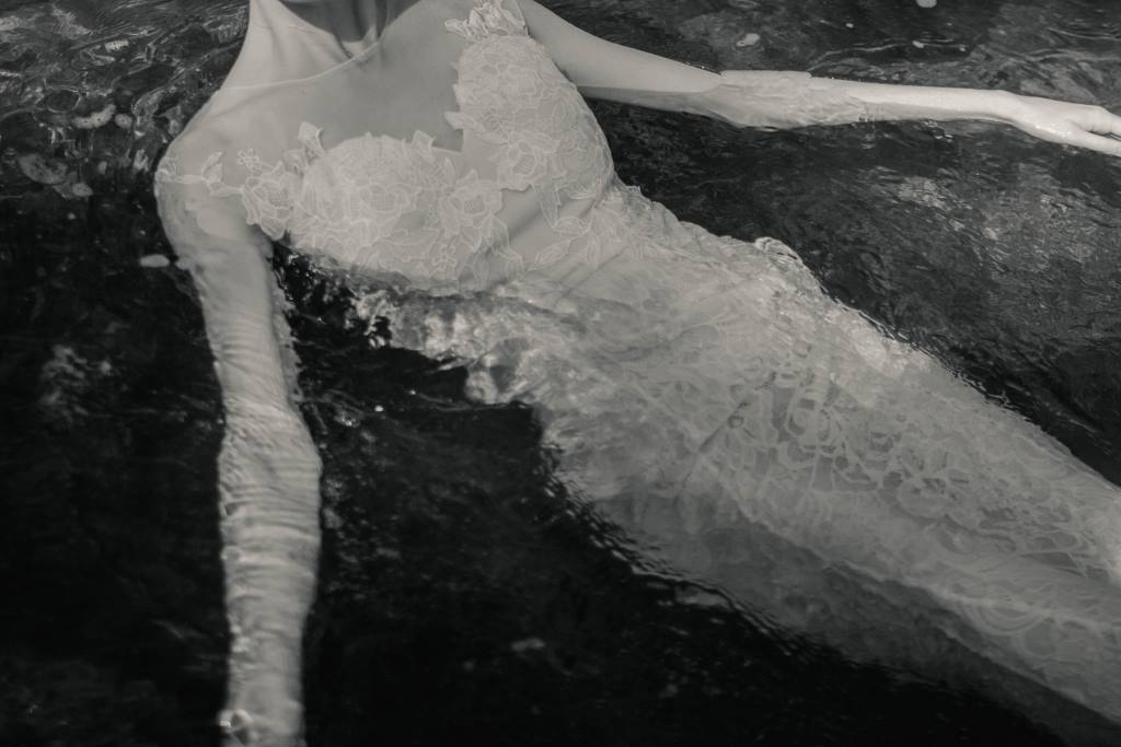
In this final photo, the subject’s head and limbs are cut off by the edge of the frame at unsettling points, something that’s generally advised to avoid. However, this gives the image an eery, mysterious quality, leaving the viewer with lots of unanswered questions.
Traditional techniques can be a great stepping-off point for creating powerful images, but using them too much can make your work feel predictable and safe. To create truly remarkable images, it’s more important to capture the essence of your subject than to conform to all the rules. Learn more about this by reading our guide to making a great photograph.
Conclusion
Arguably more important than mastering your camera settings is understanding the basics of composition. Composition is where you, as a photographer, have the most power to influence how viewers see and receive your images. This is where you get to convey a story and invoke some sort of feeling or reaction from your viewers. This is the place where your creativity really gets a chance to shine through your photographs. Run with it.
To learn more camera basics to help you master your camera, check out our Education Hub.
To stay up to date on new releases and updates, be sure to subscribe to our newsletter.


