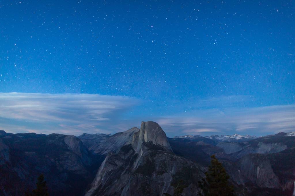
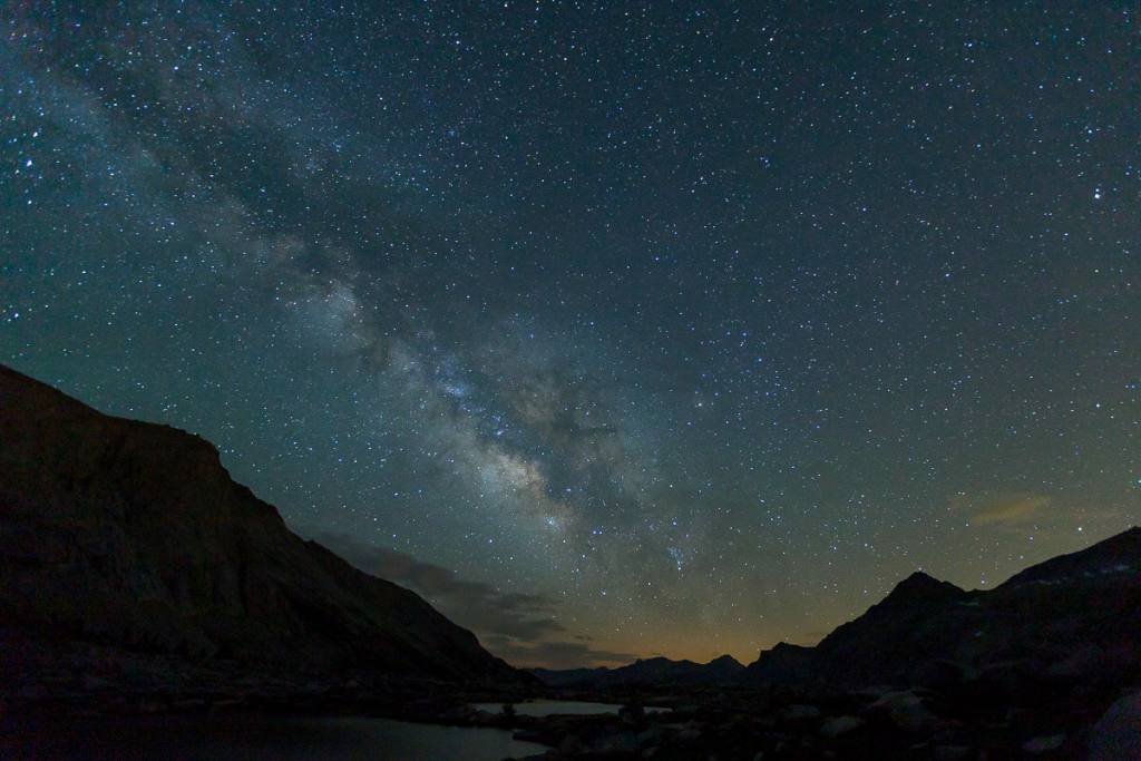
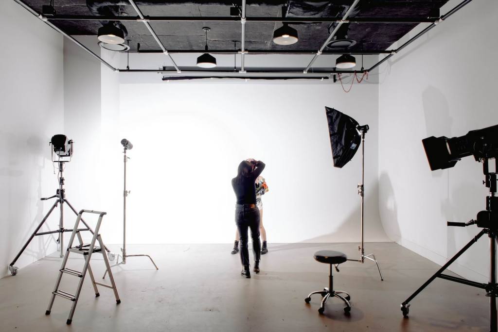
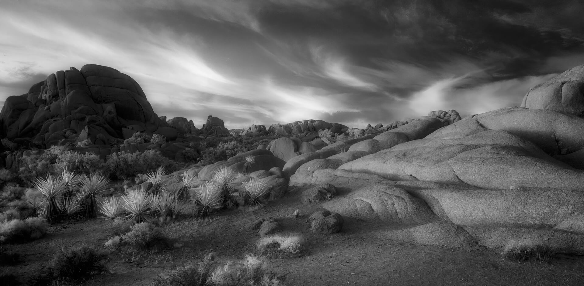
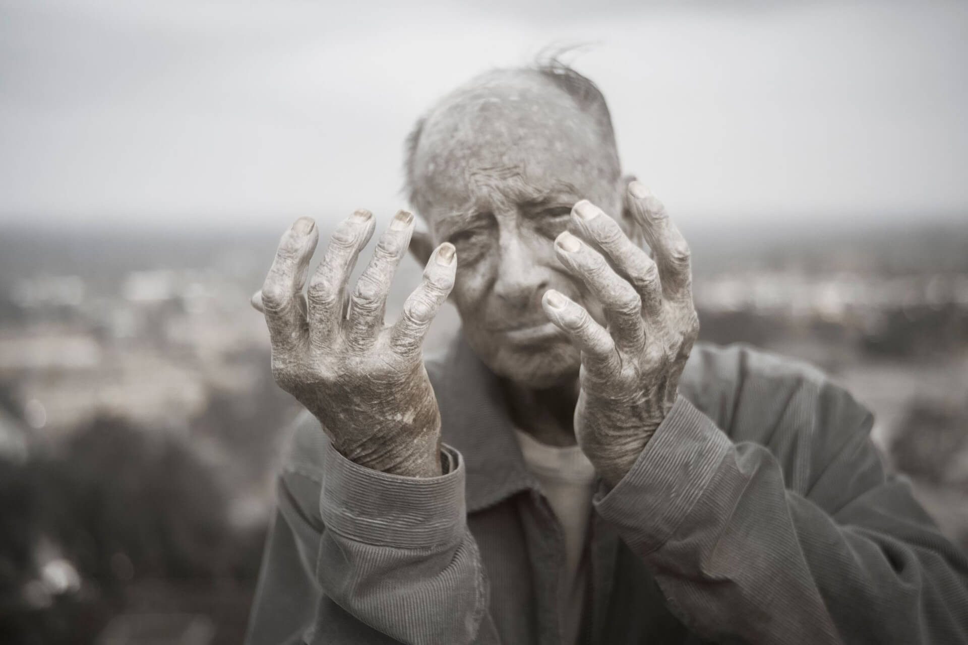
Despite how it sounds, negative space is often a good thing. This article will discuss using negative space in your photography compositions and when you might choose to fill the frame instead. Negative space, also known as blank or white space, is the space around your subject that creates breathing room.
When it comes to your photography composition, sometimes what you choose to exclude is as important as what you include. Sometimes less is more when it comes to telling a story with your photo or creating an image that grabs the viewers’ attention. You can change the impact of a photo simply by framing it a little wider or from a different angle.
We all can imagine a scene in which there are distractions and clutter. It can be hard to identify what’s happening at a glance. Understanding how to use negative space in your photography will help you take more control of your compositions.
Why Negative Space is Important
Using negative space is used to accomplish a variety of goals. It can highlight and draw attention to your subject by isolating them from the background. Additionally, you can create a sense of depth and dimension if your negative space composition includes foreground and background.
Another reason it might make more sense to fill the frame is if your subject is intricate and you want to bring them closer so that you can see the details. Or perhaps the scene is really busy, and the background is too distracting. In a bit, we’ll discuss ways to use negative space and deal with distracting backgrounds.
Beyond Breathing Room
Initially, we see negative space as a way to create breathing room around your subject. It’s a very impactful way to create balance, calmness, and harmony. Using negative space is also especially important when photos are used in graphic design because there’s space to put text.
You want to control the viewers’ eyes and draw their attention where you want it to go. Simplicity and minimalism are only the beginning of negative space. Eventually, you might see negative space as more complex than just breathing room.
Used intentionally, negative space can create tension or drama too. Instead of white space, what about black space? How does a subject on a dark background say something different than a subject on a light background?
Creating Negative Space from a Busy Scene
One of the main reasons that beginning photographers don’t naturally use negative space is that they don’t change their perspective or angle for how they see a scene. For example, if you are in a room with a cluttered floor, get low and frame your picture upwards so that the floor is eliminated from your photograph. Or maybe the background is cluttered, so you need to get high and aim down to eliminate the distracting elements behind your subject.
When you have control over the environment, try to put your subject where they’ll be against a clean backdrop. If you can’t move your subject, move yourself. Get high, low, or off-angle, and see if you can clean up the clutter simply by changing your perspective.
Another great solution can be to shoot with a low aperture like f/1.8. The shallow depth of field will create the bokeh effect that blurs out the background making it less distracting.
Digging Deeper into Negative Space
Negative space is the area around your subject that doesn’t contain any significant visual elements, thus creating balance, depth, visual interest, and breathing room around your subject. There are different ways to create and utilize negative space to take your compositions one step further.
Empty or white space is often completely empty and devoid of any subject matter. Contrasting space might be putting a bright subject on a dark background. Implied space suggests empty space even if it’s not entirely empty.
Active space is created by movements or actions of the subject, such as seeing the area from which the subject came or looking at where they are going. You might also intentionally add in some significant elements in conjunction with your use of negative space to create a more dynamic composition.
Conclusion
The key is to be intentional with your use of negative space to enhance the image’s overall composition. Don’t just settle for what you see with your eyes. Frame your photo to tell a deeper story of emotions or moods.
Start by simplifying your compositions and looking for subjects on clean backdrops. From there, it’s helpful to learn how to simplify a scene by playing with different angles and perspectives. Then, you might play with different types of negative space by paying attention to contrast, color, and story.
Learning to use negative space will help you be more intentional with your compositions and gain more control over the scene you’re working on. As you practice different uses and techniques, you can use them to inform your personal style.
Author Bio:
Marc and Brenda Bergreen are a husband and wife photo and video team based in Evergreen, Colorado. They photograph weddings and other adventurous stories in beautiful places.

